


As mentioned in previous posts, I have a small coffee problem. Two or three espressos a day is common for me. So once a year, normally in the summer, I take a break from coffee. The first week tends to be hell, with bad headaches and a need for long naps in the afternoon. But for me this is just my body realising how fatigued it is without stimulant effect of coffee. After a week, I adjust, and start to sleep really well. And after two weeks I feel my ability to concentrate increase. It is in this second week I had a revelation about Net International Investment Position (NIIP) and the US.
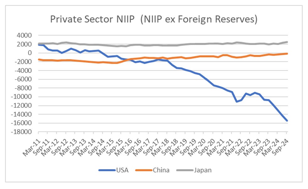
NIIP is the sum of the value of your assets invested overseas less foreigner investments into your country. A negative number mean foreigners own more of your assets than you own of theirs. I had found previously that at levels of around a negative USD 2 trillion NIIP, you should expect problems. China got to a negative USD 2 trillion private sector NIIP in 2015, just before currency devaluation fears took over. There are plenty of posts on this in my substack. Around 2017, the US also got to the USD 2 trillion level, so I started to expect dollar weakness, or stock market weakness but we have had nothing of the sort. US NIIP just keeps blowing out.
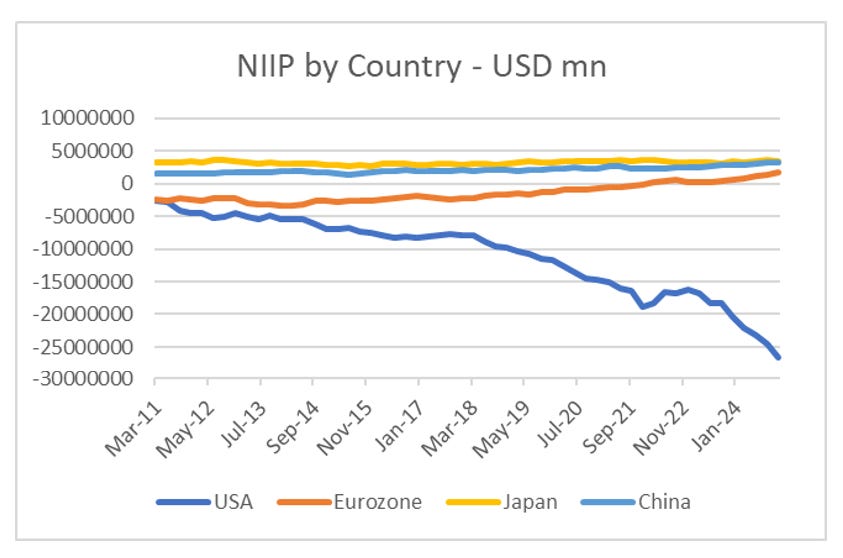
There is a very big problem with this analysis however. NIIP should sum to zero globally. A US asset, should be someone else’s liability and the converse as well. At the very least we should see a surge in a positive NIIP from Europe. We do not see this. I originally thought this could be accounted for by multinationals hiding money way in Ireland and other tax havens. I called this the “Missing Trillions”.
I am not going to lie, NIIP analysis made me a lot of money in getting bearish China when everyone else was bullish. And when something or someone is good to me, then I try and stay loyal to it. But when something is not working, I will puzzle over it for a long period of time. I want to learn from why it does not work anymore, and then make a decision.
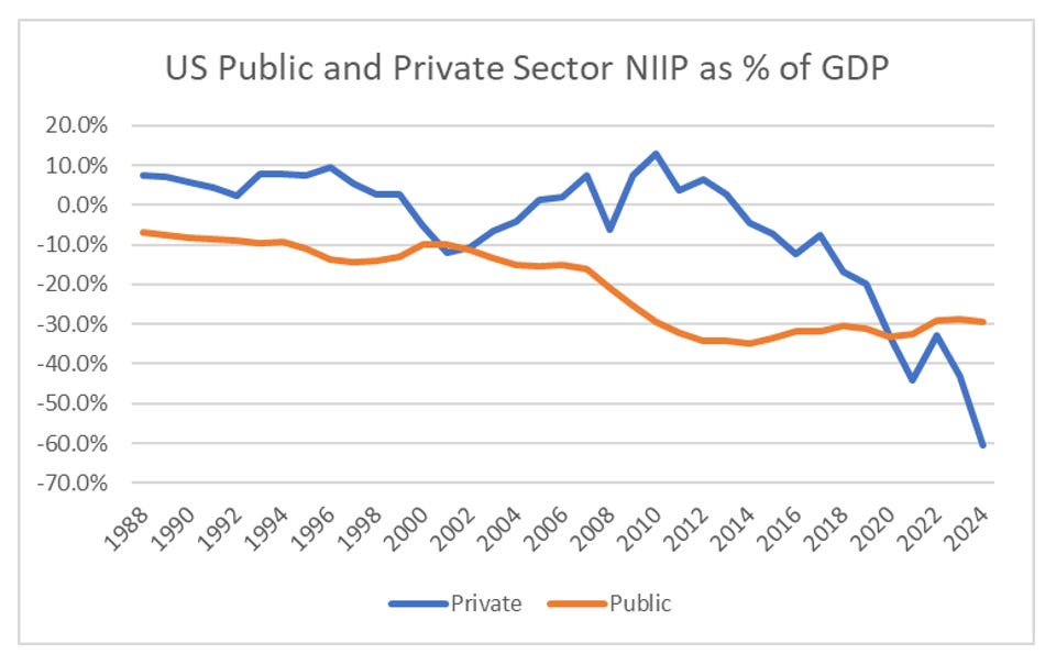
During my recent period of coffee abstinence, and after a particular deep sleep, I had a revelation. Lets take a look at the US NIIP data. The US provides the longest data set for NIIP, and I have adjusted it in two ways. One is by GDP, to “normalise it” and the second is to split between private sector, and public sector (read foreign reserves) holdings. We are obviously more interested in private sector flows. So in the dot com boom, the private sector went negative for a while, and then dollar weakness and an emerging market boom took is positive. Since 2010, we have just seen private sector NIIP blow out.
Just looking at the blue line, I was reminded of a chart I have on Bloomberg - MSCI Value/MSCI Growth. As you would expect, a similar dip in 2000, followed by a huge move lower since 2010.
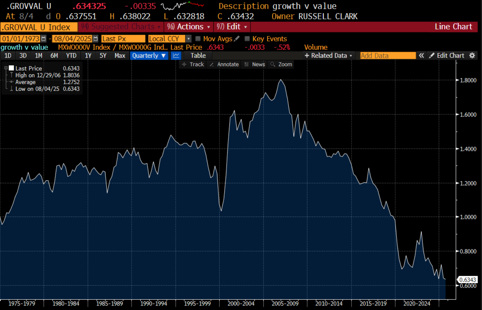
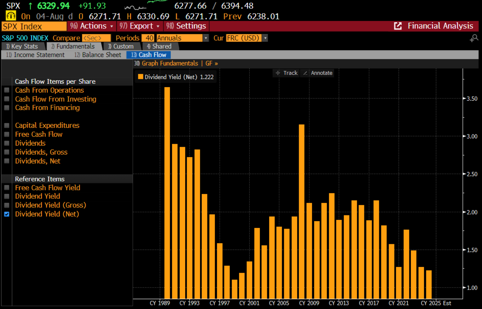
The implication here is that US NIIP is NOT driven by capital flows - but purely driven by valuation. Valuation is a slippery concept. But most transparent is dividend yield on the S&P 500. We can see that in the late 1980s it was around 3% before falling to 1.2% in the Dot Com boom. And again from 2017 to 2015 we have fallen from 2.5% to 1.2% again. There are plenty of other people who can provide long term graphs of the valuation of the S&P 500 that will match up with below.
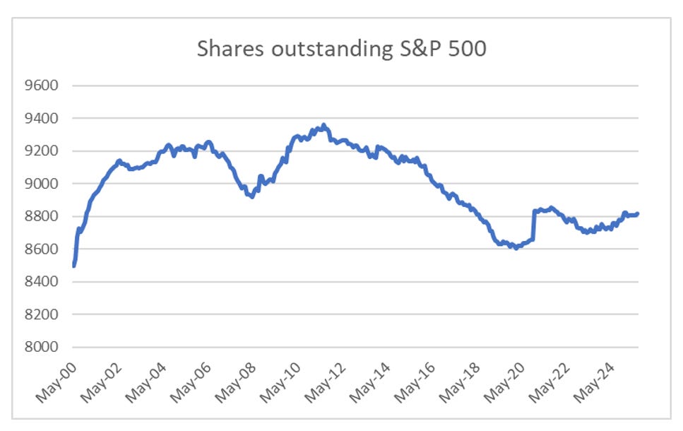
So markets are “expensive” again, and US NIIP is very negative. Is the dot com bust and dollar weakness about to happen again? Well one big difference is that even with high valuations, US corporates do not really sell much equity. Shares outstanding on the S&P 500 has flatlined in recent years - in stark contrast to the dot com days.
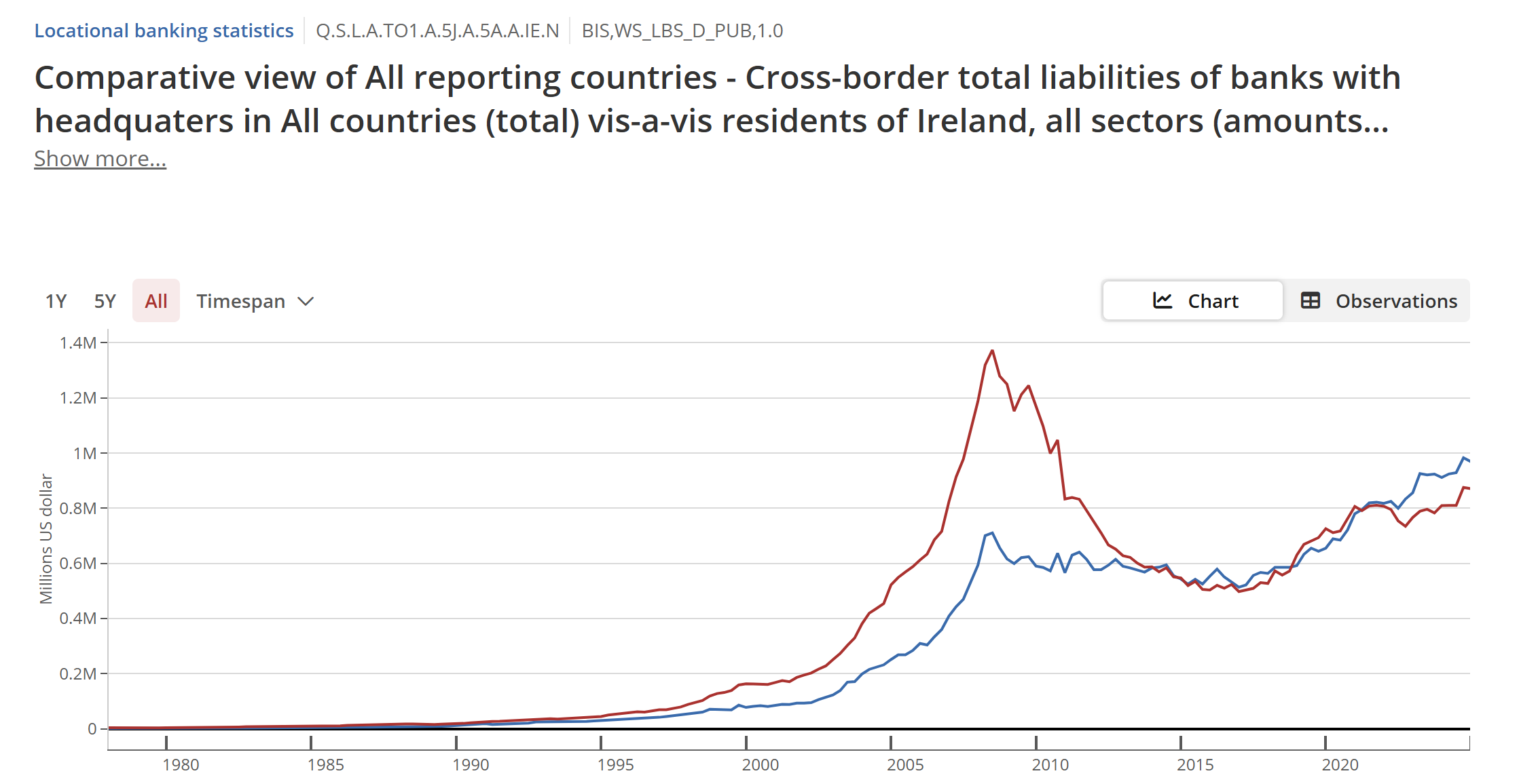
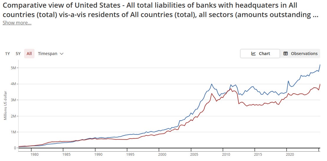
As my last two posts on AI reflect, sure I can see problems with AI, but I don’t think I can see reasons why investment will get cut, unless there is a recession. What does this mean? I started using NIIP as it seemed like a short cut to calculating capital flow data that I used to get from BIS. Ireland NIIP and BIS data both showed problems in 2007. In the BIS data for Ireland below you can see the red line, representing flow from abroad into Ireland, had surged above the blue line, which was Irish investment abroad. As this pushed up Irish valuations, this was also reflected in NIIP data.
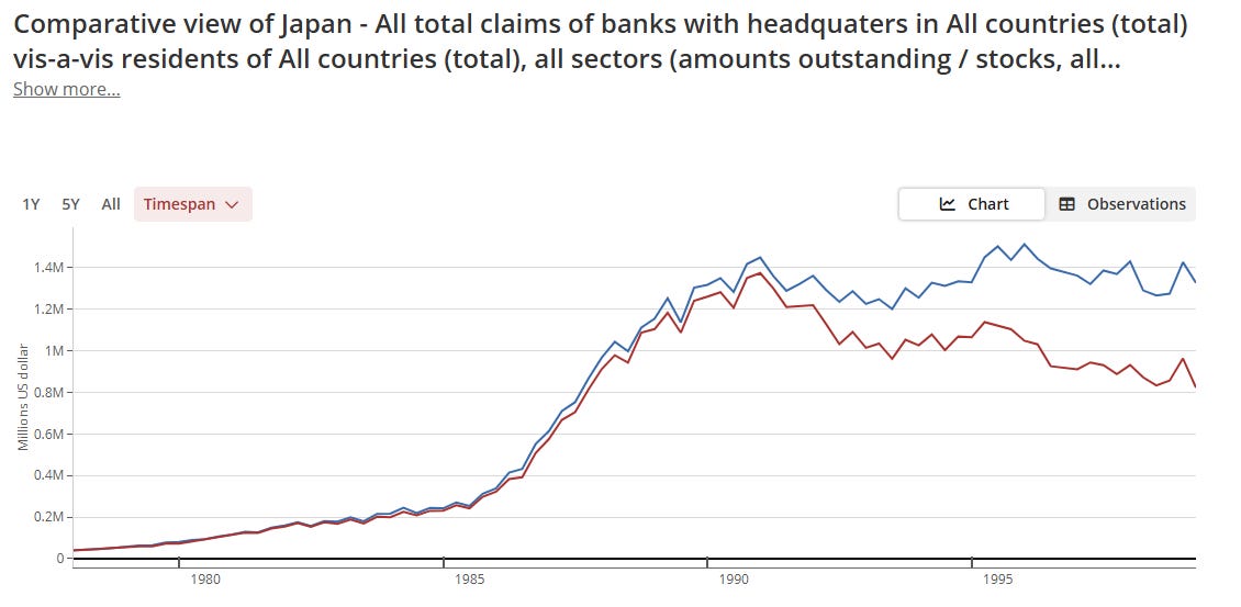
More than the gap between the two lines, I found that when financial flows surge, trouble is brewing. Japan in the 1980s saw a similar surge.
But when we look at US data, while NIIP data showed problem from 2016 onwards, BIS data only shows potential flows from 2020 onwards, but the scale is lower than what we saw in 2007.
One of the problems with BIS is that they keep changing the way they report the data, so I find that I keep having to make adjustments. When I saw that NIIP data worked just as well, I focused on that. And it worked well with emerging markets, Europe and Japan. But not the US. Sadly, with the US over 50% of equity market capitalisation, that is not an exception I can live with.
What does it all mean? I don’t think NIIP and BIS data work that well with the US. As a equity and credit based market, it operates without restraint, while Europe, Japan and Emerging Markets have bank based systems. All NIIP data tells us is that growth based investing is killing value based investing. But we knew that anyway. With the US, I will rely purely on industry analysis, but will use BIS and NIIP data for the rest of the world.
